


Marketing
Here’s a collection of marketing work I’ve created across different projects, including key art, key shots, videos, and UI renders. I’ve always enjoyed finding ways to capture what makes a project visually interesting and present it in a way that gets people excited to experience it.
FIFA World Cup: Launch Edition
Below you will find bespoke stadium renders I created for in-game menus and promotional marketing renders, while working closely with the Art Director and UI team to support the game's visual presentation.
For the stadium selection menu, I created the environment renders that appeared behind the UI, working closely with the UI team to ensure the imagery and interface came together as a cohesive composition. Each render was carefully framed around the placement of UI elements and text, as well as the menu’s transition between its expanded and collapsed states, while still showcasing the stadium as a whole. We also alternated the viewing direction of consecutive stadium renders, such as Atlanta facing right followed by Dallas facing left, creating a carousel effect that gave each venue a more distinct visual presence as players browsed through the selection. I also created both day and night versions of each stadium render, with the appropriate version displayed depending on where it appeared within the UI. In the renders and video below, I’ve presented the day and night versions side by side for viewing purposes only.
STADIUM SELECT SCREENS

Here's each of the Stadium Day/Night Renders with the UI Elements Overlayed Created by the UI Team

BREAKDOWN
Each stadium render required additional post-production work to achieve the final look established with my Art Director. This included adding depth of field, atmospheric haze, and additional lighting work, particularly for the night renders. Some shots also required paint-outs to remove artifacts introduced during rendering. Below are a few breakdowns showing the post-production process and how I brought the renders to their final presentation.

Original Render

Original Render

Original Render

Original Render
OTHER UI SCREENS
Beyond the stadium selection screens, I created additional environment renders for three other UI applications throughout the game, each featuring a different stadium and representing one of the three host countries through its assigned color: red for Canada, green for Mexico, and blue for the USA. This helped create visual variety and balance across the different UI screens.
First up is the Player Select Screen, which represented the USA through its blue color palette. Like the stadium selection renders, the UI transitioned between a closed and expanded state, with the expanded view revealing more of the full environment render.
PLAYER SELECT SCREEN

Render without the UI

BREAKDOWN
For this render, the background needed to remain relatively understated due to the number of UI elements layered over the image, while still clearly establishing the stadium environment behind them. To reinforce the USA’s assigned blue color palette, my Art Director also wanted me to introduce a blue hue into the stadium lighting, adding another subtle layer of emphasis to the assigned color.

Original Render
TOURNAMENT SCREEN
Next up is the Tournament Screen, which represented Mexico through its green color palette. Like the previous renders, the UI transitioned between a closed and expanded state, with the expanded view revealing more of the full environment render.

Render without the UI

BREAKDOWN
For this render, the background needed to remain relatively understated due to the number of UI elements layered over the image, while still clearly establishing the stadium environment behind them. To reinforce Mexico’s assigned green color palette, I placed greater emphasis on the field and incorporated the green horizontal lighting elements in the background, carrying the color throughout the composition.

Original Render
SHOOTOUT SCREEN
Lastly, is the Shootout Screen, which represented Canada through its red color palette. Like the previous renders, the UI transitioned between a closed and expanded state, with the expanded view revealing more of the full environment render.

Render without the UI

BREAKDOWN
For this render, the background needed to remain relatively open due to the number of UI elements occupying the majority of the screen, while still clearly establishing the stadium environment behind them. To reinforce Canada’s assigned red color palette, I placed greater emphasis on the outer edges of the composition, where the environment remained visible while the central portion was largely covered by the UI. The full render was then revealed during the expanded animation sequence.

Original Render
Alien: Rogue Incursion
Below is a selection of marketing renders I composed in Unreal Engine for Alien: Rogue Incursion, created for use across various promotional and advertising materials. For each shot, I composed the scene and posed the Xenomorph(s), while adding and adjusting elements such as blood, atmospheric fog, and lighting to achieve the desired mood and composition. I then brought each render into Photoshop for additional post-production and final polish, bringing the imagery to its completed state.


BREAKDOWN
For a quick look behind the scenes, my Art Director gave me free rein to develop shots that I felt would capture the Xenomorphs in action, with a few quieter, more atmospheric moments mixed in. I began by exploring the game’s levels in Unreal Engine, looking for locations that could serve as compelling settings for each shot. Once I found a location, I would build out the composition by posing one or multiple Xenomorphs depending on what best suited the scene and the story I wanted the image to convey. From there, I developed the atmosphere by adding elements such as blood and fog, along with additional lighting and, in some cases, rim lighting beneath or around the Xenomorphs to help define their silhouettes and achieve the mood I was envisioning. I would then experiment with different camera positions and angles until I found the composition that best captured the scene. Once my Art Director approved the final composition and camera angle, I brought the render into Photoshop for some finishing touches. The post-production was generally minimal after completing my shot in Unreal, often consisting of subtle adjustments in Photoshop such as adding a vignette or refining the levels to further enhance the atmosphere and bring the final image together.
Here are some of the different camera angles I experimented with before finding the one that best captured the composition I was aiming for right above this.
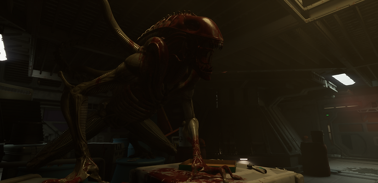
Here are a few alternate compositions I explored during the process before arriving at the final shots you see above. These are shown in their exploratory state, before any extra lights, blood, fog, etc. was added to the shot in Engine or additional post-production or final polish in Photoshop was applied.

Underwater Photography
Here’s some underwater photography I took while diving with my iPhone 17 Pro in an underwater case. Shooting underwater brings a whole new dimension to photography, and I’ve been having a lot of fun experimenting with different ways to capture the world beneath the surface.

Westworld Awakening
Below is a selection of marketing renders I created in collaboration with the Narrative team. HBO was very intentional about ensuring the imagery didn’t reveal where the story was headed, while still conveying the sense of chaos and carnage unfolding within the game. Much like the Westworld series itself, the goal was to give viewers just enough information to spark curiosity without revealing too much. The imagery was designed to offer small glimpses into the game’s story, leaving room for viewers to search for Easter eggs, uncover hidden clues, and speculate about what might happen next. Westworld Awakening was also released ahead of Season 3 and tells a story set between Seasons 2 and 3, which gave us the opportunity to incorporate subtle Easter eggs and clues that teased elements of the upcoming season without giving them away. These renders were initially released ahead of the game’s trailer to tease different moments and environments from the experience, and were later used across the game’s store pages.


BREAKDOWN
For the key art representing the game as a whole, I worked closely with the Narrative team to determine what we wanted the primary, forward-facing image to communicate. We ultimately decided to focus on Kate, the game’s main character, while being careful not to reveal too much about her story. We wanted the image to immediately create a sense that she was running from something, leaving the circumstances behind it a mystery for the viewer. Westworld Awakening follows Kate, a robotic Host who becomes self-aware, and her journey to escape the forces that have kept her bound. Throughout the game, players uncover pieces of her past, including within a storage facility containing remnants and old sets from the Westworld park. This environment plays an important role in the game’s cinematic storytelling, gradually revealing more of Kate’s history and what led her to where she is now.
Similar to my process on Alien: Rogue Incursion, I explored the game’s environments looking for a location that would best support the story we wanted the key art to convey. I ultimately chose one of the sets used during the cinematic sequences exploring Kate’s past, as I felt its visual connection to her story made it a natural fit for the composition.
I staged the majority of the shot directly in Unreal Engine, repositioning elements within the environment and introducing additional lighting to build the composition and atmosphere I was looking for. Once the scene, lighting, and camera angle were finalized, I rendered the image in Unreal Engine and brought it into Photoshop for final adjustments and polish.

Here are some of the different camera angles I experimented with before finding the one that best captured the composition I was aiming for right above this. These are shown in their exploratory state, before any extra lights, fog, etc. was added to the shot in Engine or additional post-production or final polish in Photoshop was applied.
